 Thoughts on this Photo?
#182944
03/09/04 08:45 PM Thoughts on this Photo?
#182944
03/09/04 08:45 PM
|
Joined: Dec 1969
Posts: 1,052
Jenifer Selwa
 OP
OP
Super Wacko
|
|
OP
Super Wacko
Joined: Dec 1969
Posts: 1,052 |
Can anyone give me their thoughts on this photo? 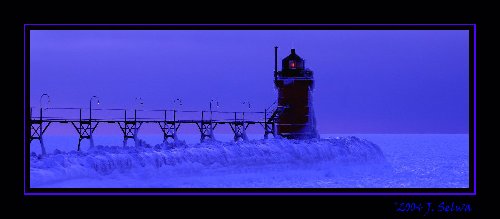
|
|
|
|
Re: Thoughts on this Photo?
#182945
03/09/04 11:11 PM
|
Joined: Dec 1969
Posts: 13,047
Webmaster
Saint
|
|
Saint
Joined: Dec 1969
Posts: 13,047 |
You mean besides the fact that it is beautiful!?
|
|
|
|
Re: Thoughts on this Photo?
#182946
03/09/04 11:21 PM
|
Joined: Dec 1969
Posts: 12,331
Bob M
Saint
|
|
Saint
Joined: Dec 1969
Posts: 12,331 |
On my monitor, it looks too blue. It's a great pic but the color looks off to me. Maybe it's just my monitor.  Bob
|
|
|
|
Re: Thoughts on this Photo?
#182947
03/10/04 12:29 AM
|
Joined: Dec 1969
Posts: 7,893
Dave H
Saint
|
|
Saint
Joined: Dec 1969
Posts: 7,893 |
It has a very, very blue tint to it. However, I wonder if this is what Jen was after? To me, the blue makes it look cool or cold, which it would be with all the ice.
|
|
|
|
Re: Thoughts on this Photo?
#182948
03/10/04 02:39 AM
|
|
Anonymous
Unregistered
|
|
Anonymous
Unregistered
|
A Blue & Gold filter?
I recently bought a blue & gold, it really can make a difference on water but I haven't tried it on ice.
|
|
|
|
Re: Thoughts on this Photo?
#182949
03/10/04 03:53 AM
|
Joined: Dec 1969
Posts: 1,052
Jenifer Selwa
OP
Super Wacko
|
|
OP
Super Wacko
Joined: Dec 1969
Posts: 1,052 |
I'll keep everyone guessing as to how I did this for another day or so and then I'll post my secret. If you surf lighthousing.net and see my answer over there, don't post it until I get a chance!
|
|
|
|
Re: Thoughts on this Photo?
#182950
03/10/04 01:38 PM
|
Joined: Dec 1969
Posts: 7,893
Dave H
Saint
|
|
Saint
Joined: Dec 1969
Posts: 7,893 |
On my digital, I have gotten a very blue picture by leaving the white balance set for tungsten lights. Didn't do it on purpose, but the pictures were very blue!
|
|
|
|
Re: Thoughts on this Photo?
#182951
03/10/04 02:29 PM
|
Joined: Aug 1999
Posts: 3,681
MtnHkr
Cruise Director
|
|
Cruise Director
Joined: Aug 1999
Posts: 3,681 |
I think its a great picture and I agree with Dave it look VERY COLD! Bert
Bert
No mountain is too tall if your first step is belief. -Anonymous
|
|
|
|
Re: Thoughts on this Photo?
#182952
03/10/04 03:16 PM
|
Joined: Dec 1969
Posts: 7,088
mombo
Saint
|
|
Saint
Joined: Dec 1969
Posts: 7,088 |
I think it would look better without all that blue snow and ice. It's March 10th and I'm ready for spring!!!  (Just kidding Jen! ) Some colors are cold and some are warm. Regardless of the snow and ice it would still look cool as blue's a cold color. I normally prefer warm colors.
|
|
|
|
Re: Thoughts on this Photo?
#182953
03/10/04 03:33 PM
|
Joined: Sep 2001
Posts: 576
rgurskey
Super Wacko
|
|
Super Wacko
Joined: Sep 2001
Posts: 576 |
Definitely looks cold. Could this be next year's Forum support limited edition print?
|
|
|
|
Re: Thoughts on this Photo?
#182954
03/10/04 06:14 PM
|
Joined: Dec 2002
Posts: 3,298
seagirt
Cruise Director
|
|
Cruise Director
Joined: Dec 2002
Posts: 3,298 |
I LOVE it. I like the blue...very chilling. Something makes the photo creepy...and that's what makes it spectacular.
|
|
|
|
Re: Thoughts on this Photo?
#182955
03/10/04 08:19 PM
|
Joined: Dec 1969
Posts: 6,801
rscroope
Saint
|
|
Saint
Joined: Dec 1969
Posts: 6,801 |
LONG ISLAND BOB
|
|
|
|
Re: Thoughts on this Photo?
#182956
03/11/04 01:02 AM
|
Joined: Dec 1969
Posts: 1,052
Jenifer Selwa
OP
Super Wacko
|
|
OP
Super Wacko
Joined: Dec 1969
Posts: 1,052 |
Bob and Dave were onto me. Here is the original: 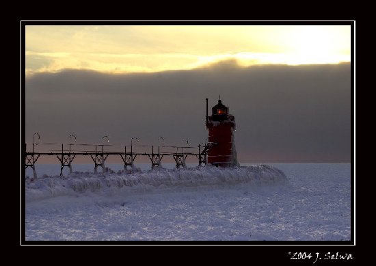 I cropped it to pano, and hued it to blue in Photoshop. Thanks for the great feedback!
|
|
|
|
Re: Thoughts on this Photo?
#182957
03/11/04 08:32 AM
|
Joined: Apr 2003
Posts: 28
skymountain
Junior Member
|
|
Junior Member
Joined: Apr 2003
Posts: 28 |
The photo looks much better in its' original form.
|
|
|
|
Re: Thoughts on this Photo?
#182958
03/11/04 11:14 AM
|
Joined: Dec 1969
Posts: 12,331
Bob M
Saint
|
|
Saint
Joined: Dec 1969
Posts: 12,331 |
Here's a question for you, Jen. Referring to the original photo, not the one with the added blue, what effect would a powerful "fill-in" flash have on the same shot?  Bob
|
|
|
|
Re: Thoughts on this Photo?
#182959
03/11/04 11:52 AM
|
Joined: Dec 1969
Posts: 13,047
Webmaster
Saint
|
|
Saint
Joined: Dec 1969
Posts: 13,047 |
Here's the image going the 'other way'. Perhaps "Hell Freezes Over" or "Global Warming". Yet we still 'see' this as a snowy image and I think our minds want to 'compensate' by thinking it must be a sunset or sunrise. 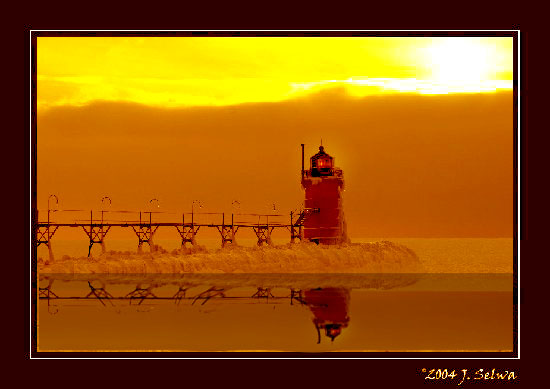 Please forgive me, Jen, for modifying your image...
|
|
|
|
Re: Thoughts on this Photo?
#182960
03/11/04 01:04 PM
|
Joined: Dec 1969
Posts: 7,893
Dave H
Saint
|
|
Saint
Joined: Dec 1969
Posts: 7,893 |
Actually, I like the blue variation because of its uniqueness.
|
|
|
|
Re: Thoughts on this Photo?
#182961
03/11/04 07:50 PM
|
Joined: Sep 2002
Posts: 166
Lighthouse Joe
Member
|
|
Member
Joined: Sep 2002
Posts: 166 |
Jenifer, I like the original. IMHO, the others look too... artificial. They look good, but not as good as the original. At least to my eyes anyway.
Nice work!
Lighthouse Joe 
|
|
|
|
Re: Thoughts on this Photo?
#182962
03/12/04 11:09 AM
|
Joined: Jan 2003
Posts: 339
Roxie
Member
|
|
Member
Joined: Jan 2003
Posts: 339 |
I also like the blue --- it makes me feel c-c-c-c-old!
Marblehead, Mass. Lighthouse, you will always have a very special place in our hearts. ....We've made the journey as far south as New Jersey, as far north as Canada. Over 100 lighthouses visited.... and so many more to go.
|
|
|
|
Re: Thoughts on this Photo?
#182963
03/12/04 12:42 PM
|
Joined: Aug 1999
Posts: 1,129
Brent
Member
|
|
Member
Joined: Aug 1999
Posts: 1,129 |
Interesting! I wonder how the blue one would look if the beacon was enhanced with just a little more light (just a "tad" more)?
Brent
OBLHS Charter Member
|
|
|
|
Re: Thoughts on this Photo?
#182964
03/13/04 07:11 AM
|
Joined: Dec 1969
Posts: 1,345
RFoster
Member
|
|
Member
Joined: Dec 1969
Posts: 1,345 |
Isn't it wonderful how one image can evoke different feelings just by a bit of adjustment in color and cropping. They are each unique and I like them all.
Ron
(CT Keeper)
Ron
(CT Keeper)
|
|
|
|
Re: Thoughts on this Photo?
#182965
03/13/04 12:19 PM
|
Joined: Dec 1969
Posts: 8,949
WackoPaul
Saint
|
|
Saint
Joined: Dec 1969
Posts: 8,949 |
Stick to the original it is GREAT!
While the blue effect catches a person's attention, the original catches the Heart!
Onward to The Land of the Midnight Sun!
|
|
|
|
Re: Thoughts on this Photo?
#182966
03/13/04 02:56 PM
|
Joined: Dec 2002
Posts: 3,298
seagirt
Cruise Director
|
|
Cruise Director
Joined: Dec 2002
Posts: 3,298 |
My opinions on the three: Blue mod: Coooold. The change makes the photo very eerie. Like the ghost of a keeper long past is going to jump out at you any second. Original: Like Paul said, it captures the heart. It has warm tones up top, morphing to cool ones on the bottom. Very unique! John's Orange Mod: Martian looking, but cool (in the neat sense of the word). It definitely looks like a sunset. Very interesting! It is amazing the changes that can be made with the features available in imaging software. You can do so many things to a photo. But of course, only the original can truly evoke the feeling of being there.
|
|
|
|
|
Forums39
Topics16,978
Posts184,640
Members2,579
| |
Most Online10,155
Jan 14th, 2020
|
|
|
2 registered members (DANIEL, Rock),
1,681
guests, and 7
spiders. |
|
Key:
Admin,
Global Mod,
Mod
|
|
|


