 Need opinions ...
#182873
08/14/04 03:02 AM Need opinions ...
#182873
08/14/04 03:02 AM
|
Joined: Dec 1969
Posts: 1,052
Jenifer Selwa
 OP
OP
Super Wacko
|
|
OP
Super Wacko
Joined: Dec 1969
Posts: 1,052 |
I decided to mess around with a new Photoshop action and just wanted some input. I don't usually digitally manipulate my images, but I absolutely love this look applied to the right image. Before...  ...and after. 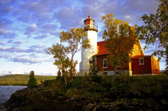 Thoughts?
|
|
|
|
Re: Need opinions ...
#182874
08/14/04 09:43 AM
|
Joined: Dec 1969
Posts: 12,331
Bob M
Saint
|
|
Saint
Joined: Dec 1969
Posts: 12,331 |
In all honesty, Jen, I like the original better. It has softer tones and really looks like it didn't need to be altered.  Bob
|
|
|
|
Re: Need opinions ...
#182875
08/14/04 10:40 AM
|
Joined: Jul 2004
Posts: 92
Too Many Stairs
Member
|
|
Member
Joined: Jul 2004
Posts: 92 |
Looks like the Velvia action that Fred Meranda created and sells?
Chesapeake Bay Lighthouse Photographer
Save The Bay
-Aaron
|
|
|
|
Re: Need opinions ...
#182876
08/14/04 02:33 PM
|
Joined: Dec 1969
Posts: 8,949
WackoPaul
Saint
|
|
Saint
Joined: Dec 1969
Posts: 8,949 |
I like the original better, also, at least in the jpg size that you posted..
I know I wouldn't change the print I have of that image...
Onward to The Land of the Midnight Sun!
|
|
|
|
Re: Need opinions ...
#182877
08/14/04 02:40 PM
|
Joined: Dec 1969
Posts: 7,893
Dave H
Saint
|
|
Saint
Joined: Dec 1969
Posts: 7,893 |
To me the original almost takes on the look of a painting when viewed at this size. Very interesting with the clouds looking as they do. (Didn't think you all had anything but blue skies and white clouds on your adventures.)
In my advanced age and fading eyesight I am trying to see what the differences are in the pictures. It appears the second one is brighter and some of picture has been brought out of the shadows (like the shore in the foreground). Is there more than this?
|
|
|
|
Re: Need opinions ...
#182878
08/15/04 03:22 AM
|
Joined: Apr 2000
Posts: 1,962
MrsTLC
Super Wacko
|
|
Super Wacko
Joined: Apr 2000
Posts: 1,962 |
Jen, I like both of them however, the second one looks really good because of the defination of colors. It makes the lighthouse stand out more. You have such a good eye for great pictures there's not much you can do to make them look better.  Ruthie
"Where words fail, Music speaks"
|
|
|
|
Re: Need opinions ...
#182879
08/15/04 11:36 AM
|
Joined: Jul 2002
Posts: 1,014
Elmer
Super Wacko
|
|
Super Wacko
Joined: Jul 2002
Posts: 1,014 |
Hi Jen,
I agree with Bob ..... like the first, unaltered pic better. I like it's soft look. The adjusted photo, although also very nice, appears somewhat harsher by comparison.
Dan
|
|
|
|
Re: Need opinions ...
#182880
08/15/04 12:54 PM
|
Joined: Dec 1969
Posts: 7,088
mombo
Saint
|
|
Saint
Joined: Dec 1969
Posts: 7,088 |
Jen, your original looks perfect to me!
|
|
|
|
Re: Need opinions ...
#182881
08/16/04 12:53 PM
|
Joined: Dec 1969
Posts: 6,801
rscroope
Saint
|
|
Saint
Joined: Dec 1969
Posts: 6,801 |
I like the second one better. It seems to provide a burst of sun which makes the house a sharper orange/rust, the tower whiter, and the sky bluer.
Bob
LONG ISLAND BOB
|
|
|
|
Re: Need opinions ...
#182882
08/16/04 02:00 PM
|
Joined: Sep 2001
Posts: 576
rgurskey
Super Wacko
|
|
Super Wacko
Joined: Sep 2001
Posts: 576 |
|
|
|
|
Re: Need opinions ...
#182883
08/16/04 03:32 PM
|
Joined: Jul 2004
Posts: 92
Too Many Stairs
Member
|
|
Member
Joined: Jul 2004
Posts: 92 |
I like the second one more too, better color saturation.
Chesapeake Bay Lighthouse Photographer
Save The Bay
-Aaron
|
|
|
|
Re: Need opinions ...
#182884
08/16/04 05:13 PM
|
Joined: Dec 1969
Posts: 1,052
Jenifer Selwa
OP
Super Wacko
|
|
OP
Super Wacko
Joined: Dec 1969
Posts: 1,052 |
Wow, looks like it's a 50-50 mix. Thank you to everyone for bring up the plus and minus points of each one. What I did to the second one is an action in Photoshop called "Gothic Glow". I'm playine around with some new stuff and was looking for some input. Here is another comparision. Original...  And Gothic Glow applied. 
|
|
|
|
Re: Need opinions ...
#182885
08/16/04 05:19 PM
|
Joined: Dec 1969
Posts: 13,047
Webmaster
Saint
|
|
Saint
Joined: Dec 1969
Posts: 13,047 |
You probably know I already favor pictures more saturated and in higher contrast than 'normal' since those are actions I took on most every lighthouse image for the Lighthouse Stickers project.
In the smaller size 2x2" of the stickers, I think it makes them 'pop' more and thus appeal to the potential buyers' eye.
|
|
|
|
Re: Need opinions ...
#182886
08/16/04 05:24 PM
|
Joined: Mar 2002
Posts: 3,102
Bob Ott
Cruise Director
|
|
Cruise Director
Joined: Mar 2002
Posts: 3,102 |
Jen,
After looking at your comparison pictures about five times, I guess that I'd have to vote for door number two. They are a tad more dramatic.
But number one is so very beautiful -- softer and more pleasing to the eye. At least to mine. However, it's very difficult to improve upon perfection. Your eyes can see what most people can't.
Bob
|
|
|
|
Re: Need opinions ...
#182887
08/16/04 06:59 PM
|
Joined: Aug 1999
Posts: 3,681
MtnHkr
Cruise Director
|
|
Cruise Director
Joined: Aug 1999
Posts: 3,681 |
#2 Jen, but you're not making it easy. Really have to look hard to make a decision. Bert
Bert
No mountain is too tall if your first step is belief. -Anonymous
|
|
|
|
Re: Need opinions ...
#182888
08/16/04 10:33 PM
|
Joined: Dec 1969
Posts: 12,331
Bob M
Saint
|
|
Saint
Joined: Dec 1969
Posts: 12,331 |
The original is far better than the altered one, Jen, on this photo. Bob
|
|
|
|
Re: Need opinions ...
#182889
08/17/04 07:23 PM
|
Joined: Apr 2004
Posts: 1,125
Bill and Judy
Super Wacko
|
|
Super Wacko
Joined: Apr 2004
Posts: 1,125 |
I like them both but the saturation is great in the second ones. Are you using the new Photoshop CS? Judy
|
|
|
|
Re: Need opinions ...
#182890
08/17/04 09:48 PM
|
Joined: Aug 2001
Posts: 1,149
AZlightkeeper
Super Wacko
|
|
Super Wacko
Joined: Aug 2001
Posts: 1,149 |
Hey Jen, Barn #2 is awesome! Makes me miss the fall season, can't wait for Maine in OCT
Jim
|
|
|
|
Re: Need opinions ...
#182891
08/17/04 10:40 PM
|
Joined: Dec 1969
Posts: 492
Kat
Wacko
|
|
Wacko
Joined: Dec 1969
Posts: 492 |
Jen, I love both formats, the original is definitly softer but the after pics are so dramatic. I guess it would depend on what your use of the picture that would determine if you should use the before or after method. Keep up the good work! Hey are you going to do a workshop at the next reunion on taking photos..sign me up!!
KAT {=*+*=}
|
|
|
|
Re: Need opinions ...
#182892
08/18/04 01:14 AM
|
Joined: Dec 1969
Posts: 1,052
Jenifer Selwa
OP
Super Wacko
|
|
OP
Super Wacko
Joined: Dec 1969
Posts: 1,052 |
Judy, I just started using PSCS from 7.0 a couple weeks ago. LOVE the shadow/highlight tool!
Kat, thanks! Not a bad idea for the next reunion...hmmm. Sounds like fun, actually! John, if they hold a reunion, who would I need to talk to about that?
|
|
|
|
|
Forums39
Topics16,978
Posts184,640
Members2,579
| |
Most Online10,155
Jan 14th, 2020
|
|
|
2 registered members (DANIEL, Rock),
1,352
guests, and 7
spiders. |
|
Key:
Admin,
Global Mod,
Mod
|
|
|


